Jump to…
You opened NetSpot because you wanted better WiFi. Maybe the internet is slow in one room, video calls freeze, the bedroom has almost no signal, or the WiFi icon looks full but everything still loads slowly. After running a survey or creating a planning project, you generated a report — and now you are looking at colorful maps, numbers, tables, and terms that may not mean much yet.
That is completely normal. NetSpot will not magically fix your network by itself. It will not move your router, change your channels, or add another access point for you. What it does is show you where the problem may be, so you can make the right change instead of guessing.
Think of the report as a WiFi checkup. It shows where the signal is weak, where other networks may be interfering with yours, where 5 GHz or 6 GHz disappears, where speed drops, and whether your changes actually helped.
A Wi-Fi report can seem confusing at first glance, especially if you’re looking for a simple answer, like, “Why is my Wi-Fi poor in this room?” or “Where should I put another access point?” The app doesn’t directly answer such questions.. The report does not give one automatic verdict, but it gives you the data you need to answer those questions. It provides specific insights about your network that can be used to make improvements.
First, understand what kind of report you have. NetSpot reports can come from a real survey or from Planning/Prediction. A Survey report is based on measurements collected in the actual space. A Planning & Prediction report shows expected coverage based on the floor plan scale, wall materials, AP placement, transmit power, antennas, and selected equipment.
The structure of the PDF report is similar, but the available maps and details may differ depending on the project type and the report settings. Survey reports help you validate a real network. Planning reports help you test a design before you build or change it. That is important to know before you start reading.
Check what was exported. The PDF report is customizable. It can include the floor plan, access point details, heatmaps, tables with network parameters, project information, and selected visualizations. It can be a short report with only a few key maps, or a large technical document with many zones, snapshots, and visualizations.
When you create or export the report, NetSpot lets you choose what to include. This is done in the report/export window with checkboxes.
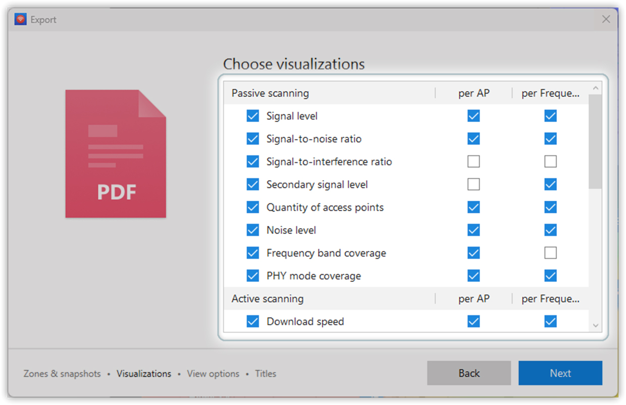
This means the report contains only what was selected. If a checkbox was not selected, that heatmap will not appear in the PDF. So if this guide mentions a map that you do not see in your report, the report is probably not broken. The map may simply not have been included during export, or it may not be available for that project type.
The same window can also include extra options such as per AP and per Frequency. If per Frequency is selected, NetSpot can add separate pages for 2.4 GHz, 5 GHz, and 6 GHz. For example, instead of only one general Signal Level map, you may also get separate Signal Level maps for each band. This is useful because 2.4 GHz usually reaches farther, while 5 GHz and 6 GHz can be faster but lose strength faster through walls.
If per AP is selected, the report can include separate views for individual access points. This helps you see what each AP contributes to the overall coverage.
So before you start reading the report, check one simple thing: did you include the maps you actually need? If not, go back to the export/report window, open the Visualizations step, select the right checkboxes, and generate the PDF again.
If you opened the report because you have a specific question, use this quick map before reading the full article. This shortcut helps you find the right place faster.
| Question | Where to look in the report |
| Why is WiFi bad in one room? | Signal Level and Low Signal Level |
| Why is my WiFi slow even though the WiFi icon looks full? | Signal-to-Interference Ratio, Overlapping Channels (SIR), and speed test maps if active testing was used |
| Why does 5 GHz or 6 GHz WiFi not reach some rooms? | Frequency Band Coverage, band-specific Signal Level |
| How do I improve WiFi coverage? | Signal Level, Low Signal Level, and Quantity of APs |
| Where should I move my router or access point? | Compare weak areas on the heatmap with the floor plan |
| Will adding another access point or mesh node help? | In a planning project, compare the same visualization across Snapshot #1 and Snapshot #2 |
| Why does WiFi drop when I walk around? | Secondary Signal Level and Low Secondary Signal Level |
| Should I use 2.4 GHz, 5 GHz, or 6 GHz? | Frequency Band Coverage and band-specific Signal Level maps |
| Why is WiFi worse in the evening or when neighbors are online? | Signal-to-Interference Ratio, Overlapping Channels (SIR), and NetSpot Inspector channel graphs |
| Did my changes actually improve WiFi? | Run another survey and compare snapshots |
| Which area or version am I viewing? | Contents, General info, Zone page, and Snapshot page. |
| How many access points are included? | General info for the project total, Zone page for the zone total, and Snapshot page for the selected version. |
| Why do I see more network rows than APs? | The tables below visualizations. One physical AP can appear as separate 2.4 GHz, 5 GHz, or 6 GHz radios. |
| Did adding another AP help? | Compare the same visualization across Snapshot #1 and Snapshot #2. |
| Is the problem interference instead of coverage? | Signal-to-interference ratio and Overlapping channels (SIR). |
| Do I have backup coverage for roaming? | Secondary signal level and Low secondary signal level. |
| Which band covers the space? | Frequency band coverage and band-specific Signal level maps. |
| Which WiFi standard is available? | PHY mode coverage. |
| Which channels, security modes, or vendors are used? | The specification table below each visualization |
Understand the Report Structure First
Before you can read a NetSpot report with confidence, it helps to understand the basic building blocks it is made of: projects, zones, snapshots, and visualizations. In multi-floor Planning projects, the report can also include buildings and levels.
A NetSpot report is usually built around these elements.
The project is the whole file. It contains your floor plan, survey or planning data, access points, and generated maps.
A building is a multi-floor structure in a Planning project. It groups several related floors together so they can be treated as parts of the same building rather than as separate areas.
A level is an individual floor within a building. Each level is shown separately in the report and can contain its own snapshots and visualizations.
A zone is a specific area you analyzed. For example, it could be one apartment, one office area, or one warehouse section.
A snapshot is a saved version of the same zone at a certain point in time. This is useful when you compare different layouts, AP placements, router settings, or before-and-after results. For example, one snapshot may show coverage with one router, while another snapshot may show what happens after adding a second access point.
A visualization is one specific heatmap or diagnostic map. Signal level, signal-to-interference ratio, frequency band coverage, PHY mode coverage, and low signal level are all different visualizations. They show the same space from different angles.
Why this is important: Don’t confuse these concepts. If you are reading a multi-floor Planning report, first check which building and level you are viewing. If your report contains multiple zones, first make sure you’re reading the correct area. If your report contains multiple images, make sure you’re comparing the same visualization across all images. Comparing the signal level in one image with the frequency range coverage in another will only confuse you.
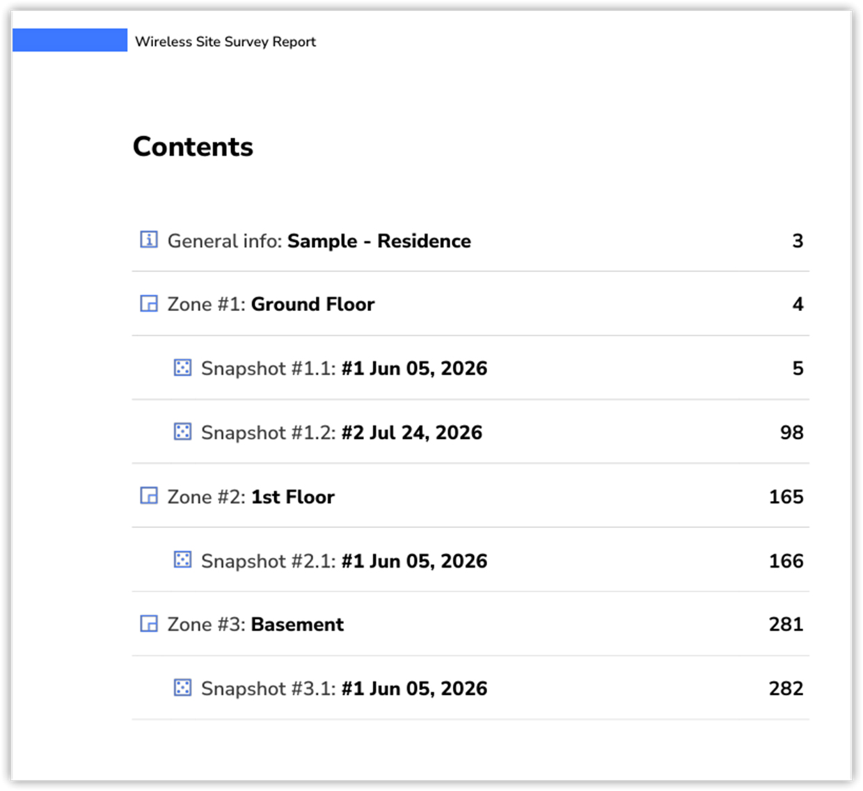
Contents Page
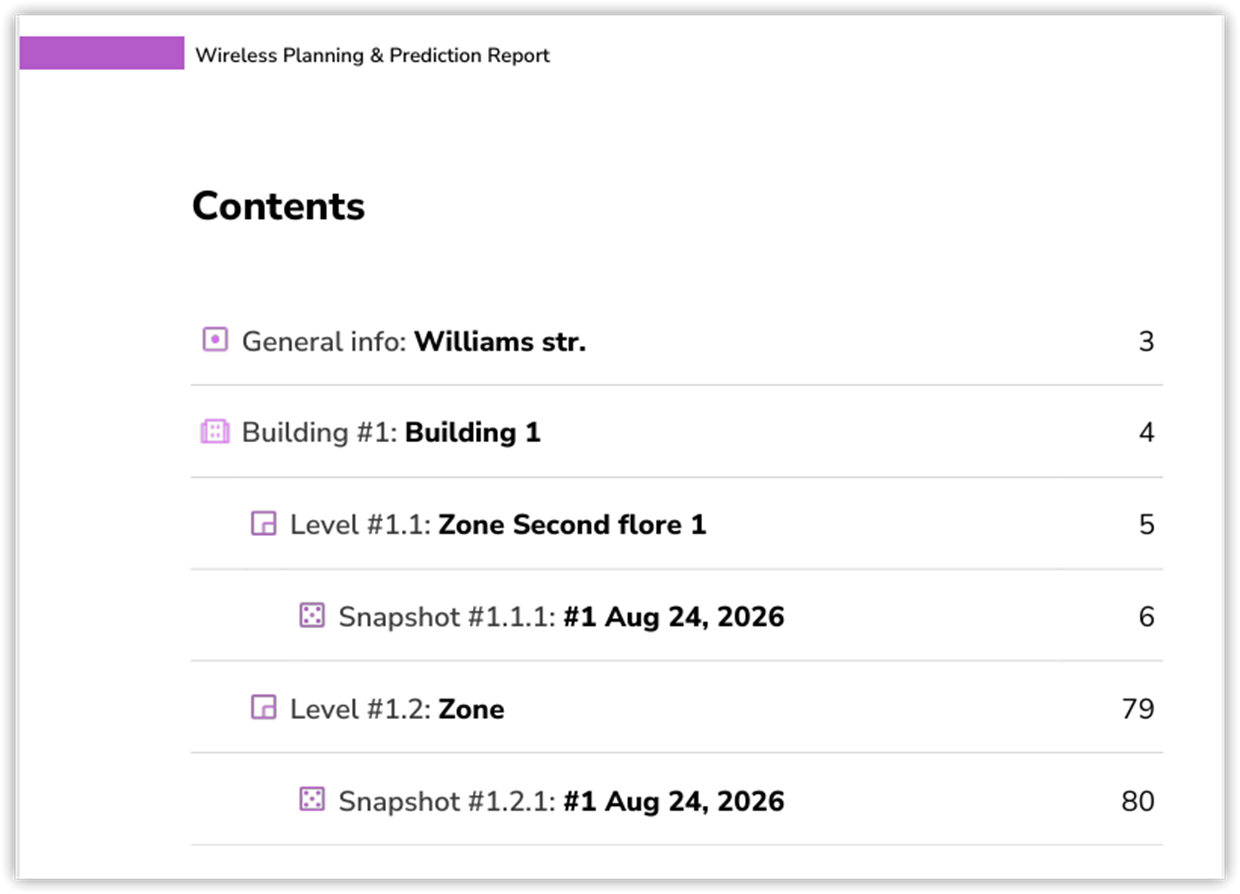
The Contents page gives you the first quick overview of the report. It usually lists the General info section, each zone, and each snapshot inside that zone. In a multi-floor Planning report, the structure may also include buildings and individual levels, with snapshots organized under the corresponding level.
Use this page as your map. It tells you how the report is organized and where each part begins.This is especially useful in larger Planning projects, where several floors may be grouped within the same building.
General info page: what is included in the project?
A NetSpot report usually starts with the General info page. Don’t skip it. This page is not the diagnosis yet — this page serves as an introduction to the project and its main components.
Here you can see:
- the project name;
- the date when the project was created and modified;
- the number of zones;
- the number of snapshots;
- the number of access points included in the report.
Think of it as a project summary: it tells you what is included before you begin examining individual maps and visualizations. The actual Contents page is your navigation map; the General info page gives you the project-level context.
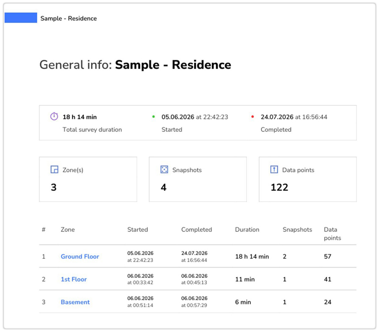
For example, a report may show 1 zone, 2 snapshots, and 3 APs. That means the project contains one analyzed area, two saved versions of that area, and three access points included in the project.
In a Planning report, the General info page may also show the number of buildings and levels. This is especially relevant for multi-floor projects, where several floors are organized under the same building.
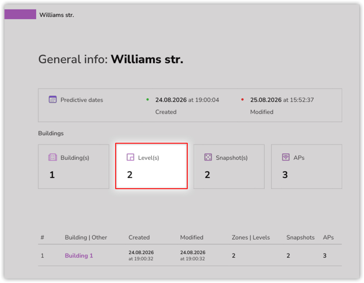
In a Planning report, you may instead see building and level counts. For example, 1 building and 2 levels means the project contains two planned floors grouped within the same building.
This page matters because it helps you read the report in the right context. If there are several zones, first check which area you are reviewing. If there are several snapshots, make sure you know whether you are looking at the initial version, the final version, or an intermediate step. If several APs are listed, remember that the General info page gives you the project-level picture; the actual heatmaps will show how those access points affect coverage, signal quality, interference, and other Wi-Fi conditions in a specific zone or snapshot.
The structure you see here depends on the project type. In a Survey report, NetSpot usually moves from the project summary directly to a zone. In a Planning report, there is an additional hierarchy:
Building → Level → Snapshot.
So before we look at the usual Zone page, it is worth covering the two extra pages that appear in Planning reports.
Building Page: which building are you reading?
In a Planning report, NetSpot groups planned areas into buildings and levels. After the General info page, you may therefore see a separate Building page before the report moves to a specific floor.
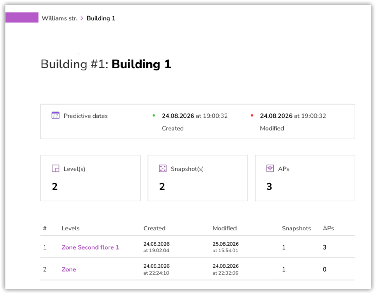
At the top of the page, you will see the building number and name.
For example: Building #1: Building 1
This tells you which building in the project you are currently reviewing. It is especially useful in larger planning projects that contain more than one building.
The Building page also shows the Predictive dates — when the building was created and when it was last modified. These dates help you check whether you are looking at the latest version of that part of the project.
Next, NetSpot gives you a quick summary of what is included in the building:
- the number of levels;
- the total number of snapshots;
- the number of APs included in the building.
For example, a report may show 2 levels, 2 snapshots, and 3 APs. This tells you that the building contains two planned floors, two saved design states, and three access points in total.
Below that, the report lists the individual levels inside the building. The table usually includes the level name, creation and modification dates, the number of snapshots, and the number of APs associated with each level.
This is useful because the APs do not necessarily have to be distributed evenly between floors. One level may contain three APs, while another may currently contain none.
So before you open a particular floor, the Building page gives you the building-level context: how many levels are included, how many saved versions exist, and where the planned APs are located.
Level Page: which floor are you reading?
After the Building page, a Planning report moves to the Level page. This is where NetSpot begins describing a specific floor or planned area in more detail.
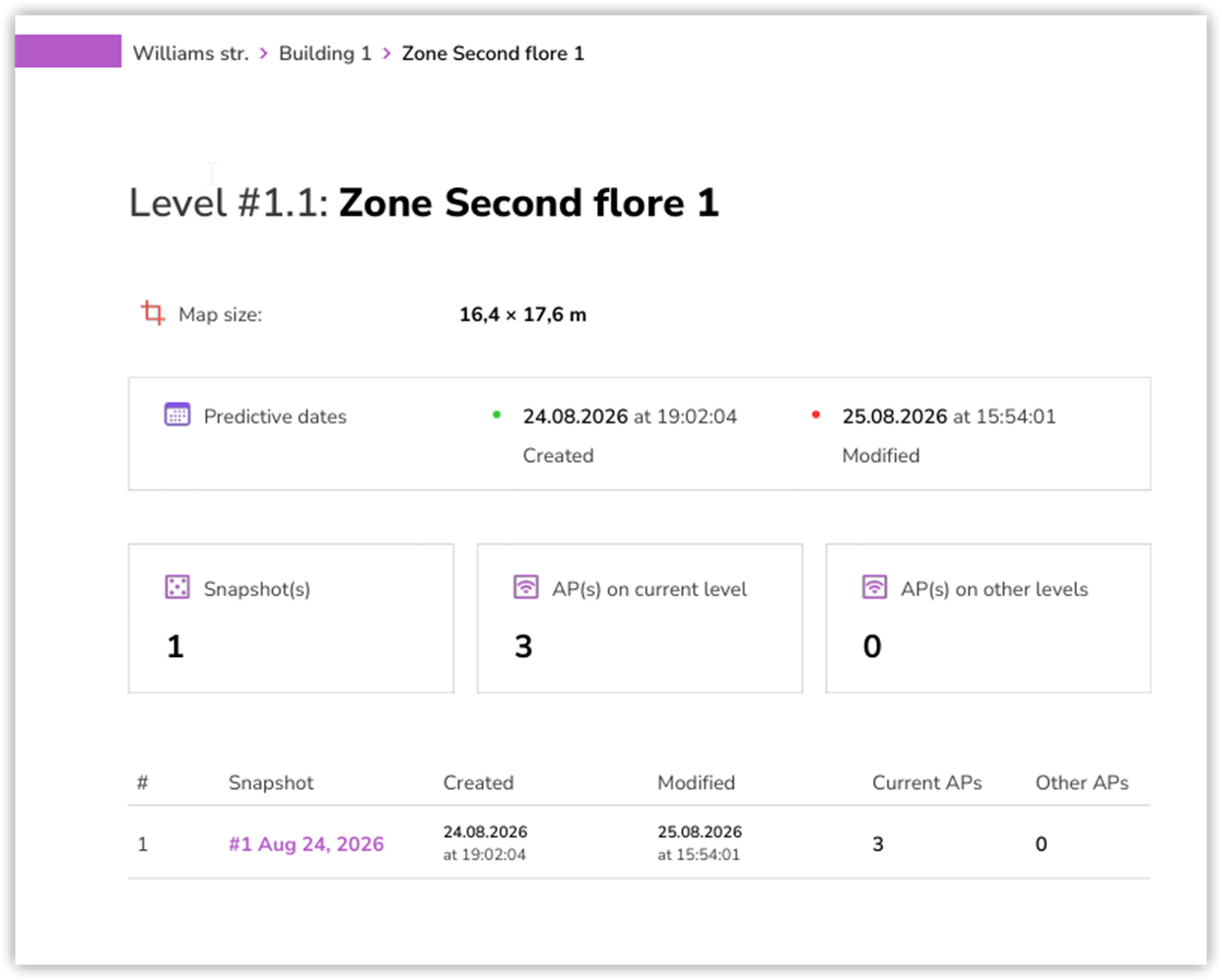
At the top of the page, you will see the level number and name.
For example: Level #1.1: Zone Second floor 1
The name helps you identify exactly which floor you are reviewing, especially when the building contains several levels.
The Level page also shows the map size.
For example, the report may show 16.4 × 17.6 m. As with a Zone page, these are the real-world dimensions assigned to the floor plan.
The scale matters because NetSpot uses these dimensions when modeling distances and WiFi coverage. If the map is not scaled correctly, the resulting predictive heatmaps may not accurately represent the real space.
You will also see the Predictive dates, showing when this level was created and when it was last modified.
Next comes an important Planning-specific summary:
- the number of snapshots;
- the number of APs on the current level;
- the number of APs on other levels.
For example, the report may show 3 APs on the current level and 0 APs on other levels.
This distinction is useful in a multi-floor design because it tells you immediately whether the access points affecting the project are placed on the floor you are reviewing or elsewhere in the building.
Below that, the report lists the snapshots saved for this level. For each snapshot, you can see its name, creation and modification dates, as well as the number of Current APs and Other APs.
So before moving on to the snapshot itself, the Level page answers three basic questions: Which floor am I looking at? How many saved versions does it have? And where are the APs associated with this design located?
Zone Page: which physical area are you reading?
In a Survey report, the report usually moves from the project summary directly to the zone section. Since we already covered what a zone is earlier, here the important part is understanding how NetSpot presents information for that area in the report.
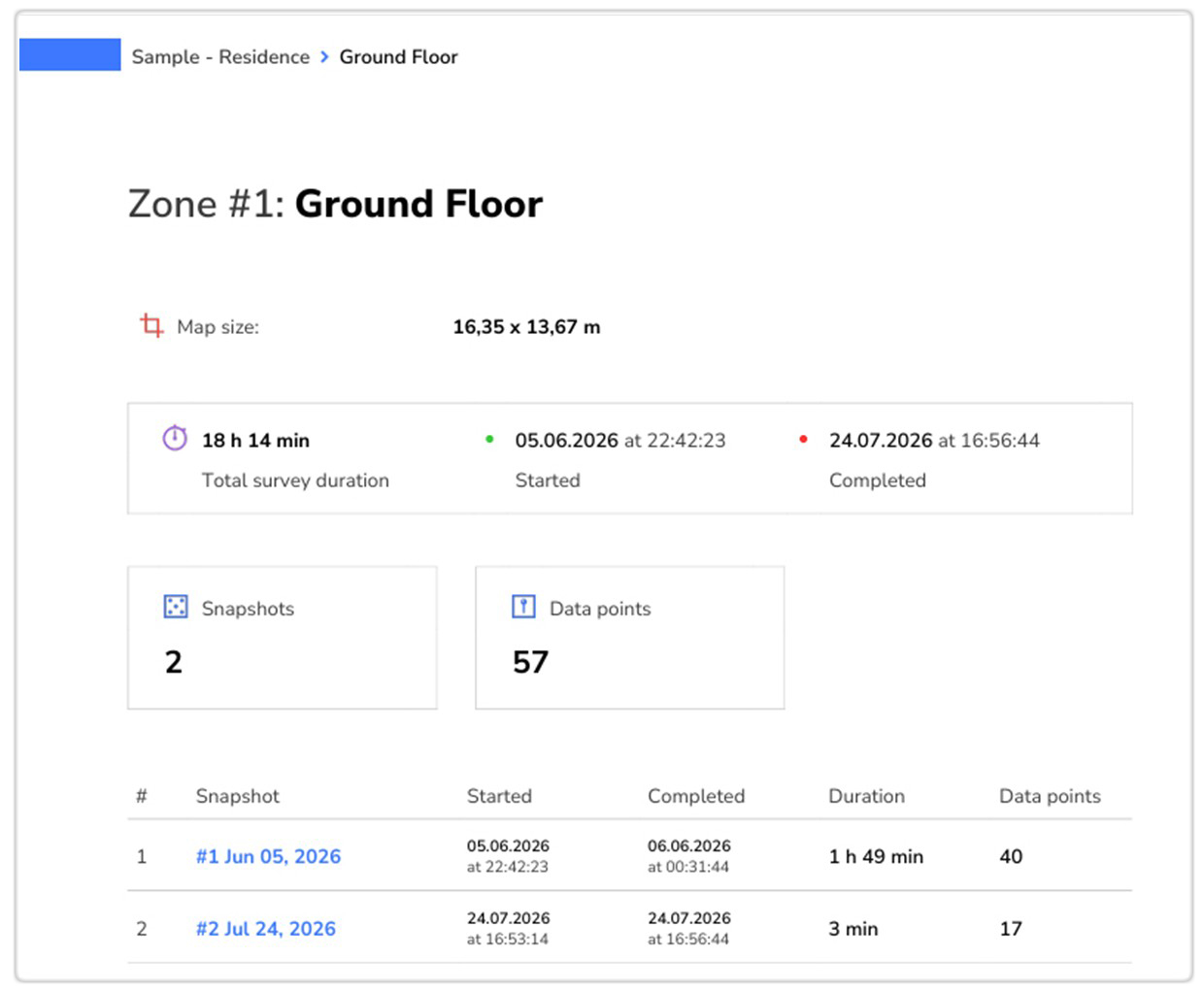
At the top of the zone page, you will see the zone name.
For example, a report may contain a zone called Library – First Floor, Warehouse Section A, Office Wing East, or Apartment 1.
If your project has several zones, these names help you quickly identify which specific area of the building you are reviewing.
The map size shows the real-world dimensions of the floor plan used for this zone. For example, the report may show a map size of 13.67 × 14.84 m. This number matters because WiFi coverage depends heavily on distance. If the floor plan was not scaled correctly, the heatmap may still look clean, but the predicted or measured coverage may not match the real space accurately.
The zone page also shows the created and modified dates. In a predictive report, these are shown as predictive survey dates. They tell you when this zone was first created and when it was last changed. This is useful when you compare different design versions or check whether you are looking at the latest report.
Next, you will usually see the number of snapshots and APs in that zone. Snapshots are saved versions of the same zone. APs are the access points included in that zone across those snapshots.
Below that, the report lists the snapshots inside the zone. This table usually includes the snapshot number, snapshot name, creation date, modification date, and the number of APs in each snapshot.
This table is especially important when the report contains more than one snapshot.
For example, Snapshot #1 may include one access point, while Snapshot #2 may include two access points. That is a strong clue that the report is showing a before-and-after comparison or two different planning options.
Snapshot Page: which version are you reading?
After the Zone page, the report usually includes information about a specific snapshot. A snapshot represents a separate state of the project and typically corresponds to a particular access point layout or design option.
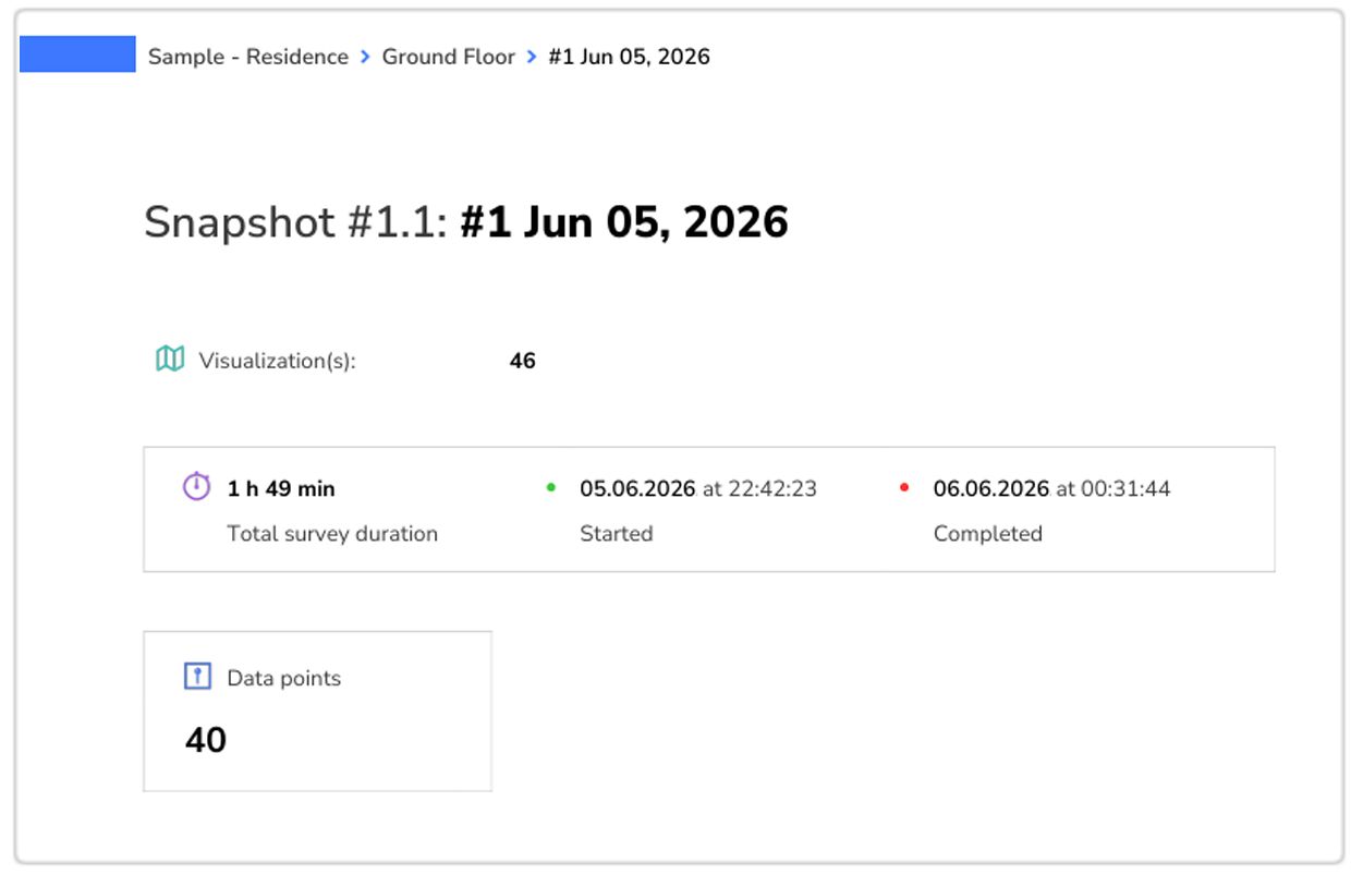
At the top of the page, you will see the snapshot name and number.
For example, Snapshot #1.1: #1 May 30, 2026 means this is the first snapshot inside Zone #1. If the next section says Snapshot #1.2, that means you are looking at another saved version of the same zone.
The snapshot page also shows how many visualizations are included in that snapshot.
For example, it may say Visualization(s): 18. This means the report will include 18 different maps or diagnostic views for this one snapshot. These may include Signal level, Signal-to-interference ratio, Frequency band coverage, PHY mode coverage, Low signal level, Overlapping channels, and other visualizations depending on the project type and selected report settings.
You will also see the created and modified dates for this specific snapshot. These dates may differ from the zone dates because a zone can contain several snapshots, and each snapshot can be created or changed separately.
Finally, the snapshot page shows how many APs are included in that particular snapshot. This is one of the most important details on the page. If Snapshot #1 has 1 AP and Snapshot #2 has 2 APs, do not read their heatmaps as two random maps. Read them as two different network versions.
That context changes how you interpret everything that follows. A weak signal area in Snapshot #1 may disappear in Snapshot #2 because another AP was added. A better 5 GHz map may appear because the AP placement changed. A worse interference map may appear because the new AP uses an overlapping channel or creates too much same-band coverage in one area.
So before you start reading the heatmaps, check three things on the snapshot page:
- which snapshot you are viewing;
- how many visualizations it contains;
- how many APs are included.
This will help you understand whether the maps show the original design, a modified design, or a comparison point in the middle.
Wi-Fi heatmaps
Now you are ready for the Wi-Fi heatmaps. This is usually the part people care about most, because this is where the report stops being a list of project details and starts showing what is actually happening with Wi-Fi across the space.
As mentioned earlier, a NetSpot report can vary significantly depending on how it was generated. It may include different heatmaps depending on the project type, the data that was collected, and the checkboxes selected when the PDF report was created.
So do not worry if your report does not include every heatmap mentioned here. The goal is not to memorize every possible visualization. The goal is to understand how to read the maps you do have and how to use them to answer a practical Wi-Fi question.
A simple workflow is:
What problem am I trying to solve? → Which heatmap should I open? → What pattern do I see on the map? → What could be causing it? → What should I try next? → How do I check if it helped?
A NetSpot report can contain many visualizations, and each one looks at wireless performance from a different angle. At first, this can feel like too much information. But this is actually one of the strongest parts of the report.
Wi-Fi problems rarely come from one single number. A room may have acceptable signal strength but poor interference conditions. Another area may have good 2.4 GHz coverage but weak 5 GHz coverage. Another spot may look fine on the general Signal level map but still appear problematic on a diagnostic heatmap. Reading several visualizations together helps you understand the real cause instead of guessing.
How to Read a Heatmap Page
Before you interpret the colors, read the page itself.
The important thing is to read each visualization page in the same order.
Most heatmap pages follow the same basic logic.
First, look at the page header. It shows where you are in the report: the project, the zone, the snapshot, and the name of the current visualization.
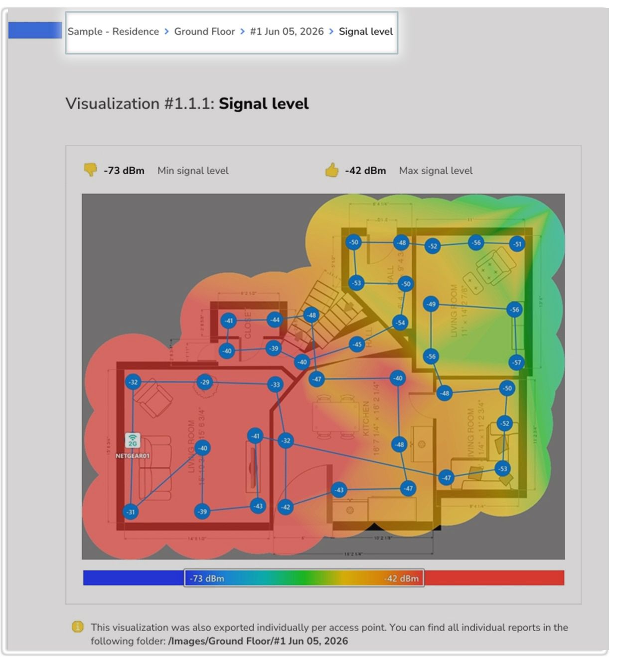
This matters because the same report may contain several snapshots of the same zone. One snapshot may show the original layout, while another may show a changed router position, an added access point, or a different planning option. If you compare maps without checking the snapshot name first, you may accidentally compare the wrong versions of the project.
Also pay attention to the visualization name. Some visualizations may appear more than once. You may see a general version, such as Signal level, and then separate versions for specific bands, such as Signal level (2.4 GHz), Signal level (5 GHz), or Signal level (6 GHz). Which versions appear depends on the access points and frequency bands included in that snapshot.
The general map gives you the big picture, while band-specific maps help you understand how each band covers the same space.
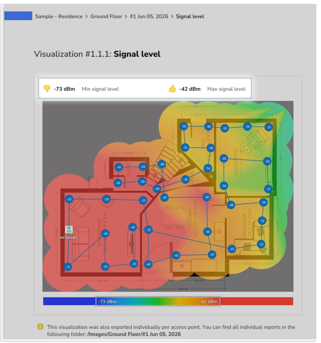
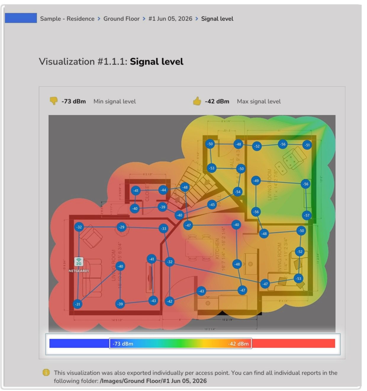
Next, look at the values above the map.These may show the minimum and maximum values for that visualization, or they may show threshold values used to classify areas as acceptable, warning, or critical.
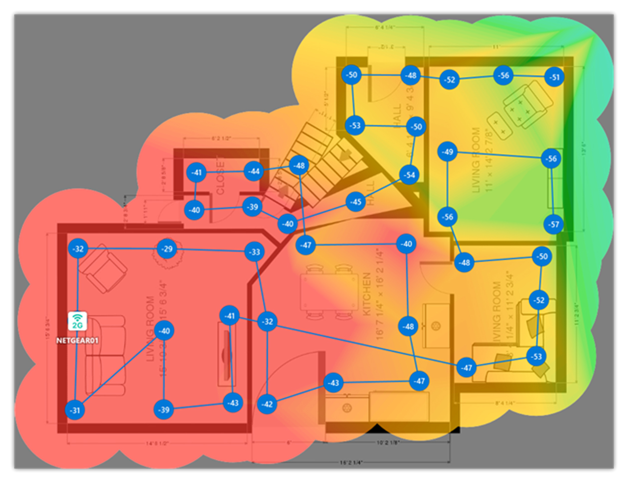
Next, look at the heatmap itself. Not all heatmaps are displayed the same way.
Some visualizations use a continuous color gradient, where the color changes gradually as the measured or predicted value changes.
For example, a Signal Level map may show stronger signal near an access point and weaker signal farther away, making it easy to see how coverage changes across the space.
Other visualizations are designed primarily for troubleshooting. These maps often use a simple color scheme: green for areas that meet the selected requirement, yellow for areas that are close to the limit or may need attention, and red for areas that fail to meet the requirement. This makes it easy to quickly identify parts of the space that may need further investigation or improvement.
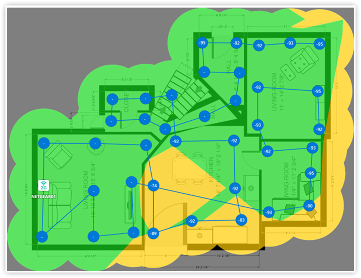
In practical terms, troubleshooting heatmaps answer a simple question:
Does this area meet the target, is it close to the limit, or does it need attention?
This approach is useful because Wi-Fi requirements vary. A signal level that is perfectly acceptable for web browsing may not be sufficient for video conferencing, VoIP, roaming, warehouse scanners, or other demanding applications. Troubleshooting maps help you quickly identify areas that fall below the selected threshold.
Then look at the color legend under the map. The legend connects the colors on the floor plan with actual values or categories. Do not assume that a color always means the same thing on every heatmap. Always check the legend for the current visualization.
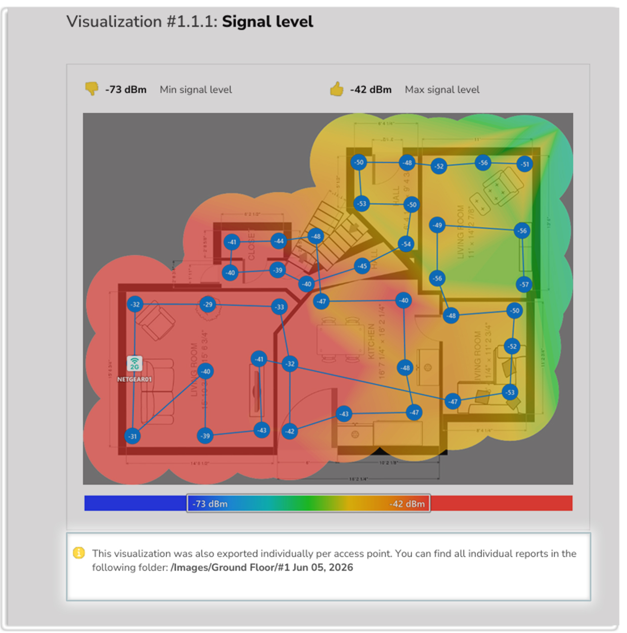
In planning reports, you may also see a note saying that the visualization was exported individually, with a folder path where those individual reports can be found.
Below each Wi-Fi heatmap visualization, the report typically includes a table with the specifications for that visualization. Depending on the visualization, the table may display data such as network name, channel, PHY mode, security, signal-related values, and vendor.
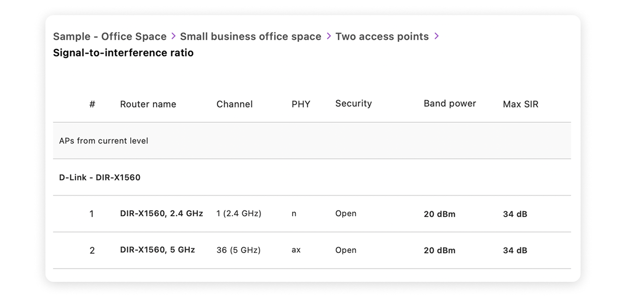
Do not read the table under the heatmap as the main interpretation of the colored map. First read the values above the map and the color legend below it. Those values tell you how the heatmap itself is scaled.
The table below the visualization helps you identify the networks or AP radios included in that view, such as network name, channel, PHY mode, security, and vendor. Some values in the table may describe the AP or radio entry rather than the exact best or worst value shown across the floor plan.
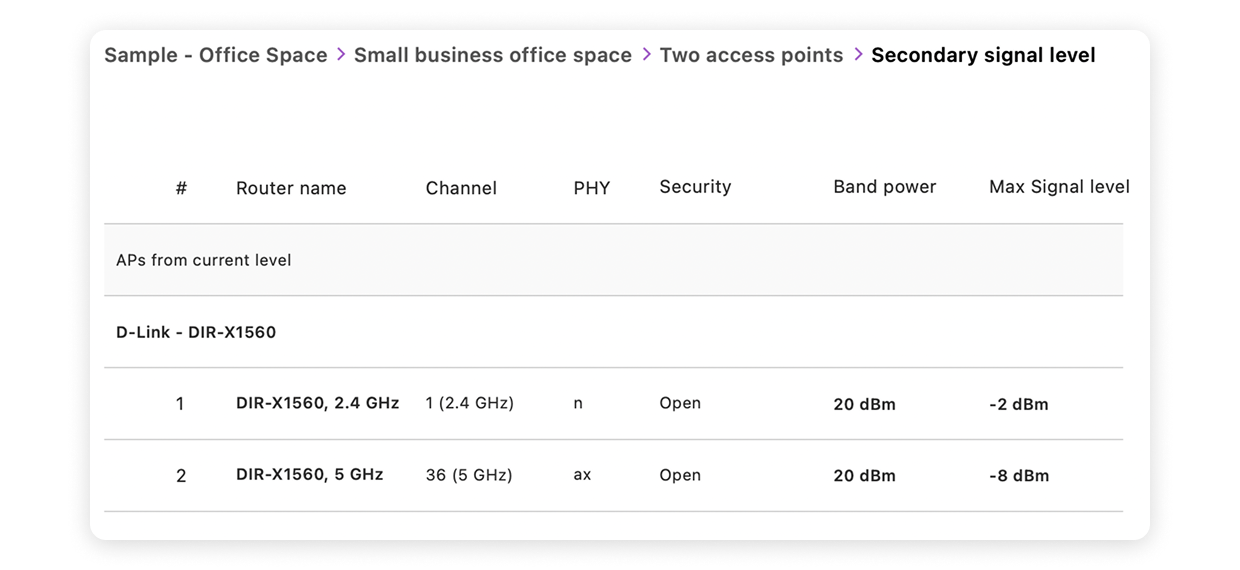
Do not be surprised if the AP count and the number of rows in a later table do not match exactly. A report may say that a snapshot has 2 APs, but the visualization table may show four rows because each dual-band AP appears once for 2.4 GHz and once for 5 GHz. In other words, AP count usually describes physical devices, while table rows often describe networks, radios, or bands included in that visualization.
Do Not Read Every Heatmap the Same Way
A common beginner mistake is to look at one colorful map and make a final decision from it. That can be misleading.
A strong signal does not always mean a good Wi-Fi experience. A room may have a strong signal but still feel slow because the channel is crowded. Another room may have usable 2.4 GHz coverage but poor 5 GHz coverage. A multi-AP network may look fine on the main Signal Level map but still have poor secondary coverage for roaming.
Instead of asking, “Is this heatmap good or bad?” ask a more specific question:
✔️ Am I checking coverage?
✔️ Am I checking interference?
✔️ Am I checking roaming?
✔️ Am I checking band availability?
✔️ Am I checking speed?
✔️ Am I checking whether the design meets a selected threshold?
Once you know the question, it becomes much easier to choose the right visualization.
Which WiFi Heatmap Visualization Will Help You Identify the Problem?
The easiest approach is to start with the problem you are trying to solve rather than with the heatmap itself. Different visualizations answer different Wi-Fi questions, so choosing the right one can save a lot of guesswork.
Let’s look at some common situations and the heatmaps that can help you investigate them.
Weak Wi-Fi in one room
If Wi-Fi is weak in one room, start with Signal Level and Low Signal Level.
The Signal level heatmap is usually the best place to start. It shows how strong the WiFi signal is across the floor plan and helps you quickly spot areas where the connection may feel stable, weak, or unreliable.
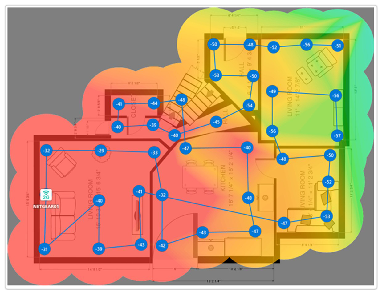
In simple terms, signal level tells you how well your device can “hear” the access point. WiFi signal is measured in dBm. These numbers are usually negative, so closer to zero means stronger signal. For example, -45 dBm is stronger than -70 dBm.
For Signal level, start with the minimum and maximum signal values shown above the heatmap and then read the color legend under the map. The table below the map is useful for identifying which APs or radios are included and what channel, band, PHY mode, security type, and vendor they use.
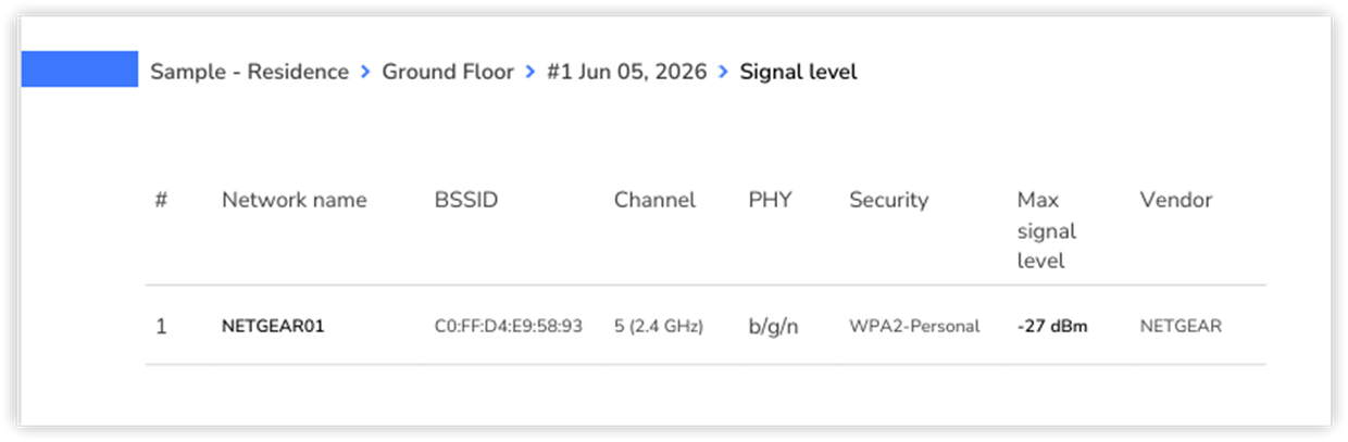
Use the colored floor plan itself to judge where the signal stays usable and where it fades. On the heatmap, warmer colors by default show stronger signal areas, and cooler colors show weaker areas.
What you may see: If most of the area is warm or greenish, the signal is probably strong enough across the zone, but always check the minimum and maximum values and the color legend for that specific map first. In most Wi-Fi environments, a signal between about -30 dBm and -60 dBm is considered strong. A signal between -60 dBm and -67 dBm is usually still good for everyday use.
Look for cold-blue areas, those areas may have poor coverage — dead zones, or places where the signal drops below the selected threshold. As a general rule, areas around -70 dBm or weaker may already have poor coverage and can cause slow speeds, unstable connections, or disconnects. If the weak area is far from the router, distance may be the main issue. If the signal drops sharply right after a wall, cabinet, elevator shaft, metal rack, or equipment room, the building material may be causing strong attenuation.
If the 2.4 GHz map looks better than the 5 GHz or 6 GHz map, that is normal in many buildings. Lower frequencies usually travel farther, while higher frequencies often provide better performance closer to the AP but lose strength faster through walls.
What to try:
Move the router or access point to a more central, open position.
Avoid placing APs inside closets, behind TVs, near metal objects, or low to the floor.
Compare the general Signal level map with the band-specific maps before making changes.
Add another access point if the space is too large for one AP.
Use wired backhaul where possible instead of relying on repeaters.
If this is a planning report, try another AP location and create a new snapshot to compare the result.
Low Signal is one of NetSpot’s heatmaps in the troubleshooting section. Unlike standard visualization heatmaps, which typically use a continuous color gradient to show coverage changes across the entire room, troubleshooting heatmaps are designed to answer a more practical question: does this area meet the selected requirement?
For this reason, these maps use color coding based on thresholds rather than a full gradient. Areas are grouped into categories based on predefined values, making it easy to quickly identify problem areas without having to interpret subtle differences in color.
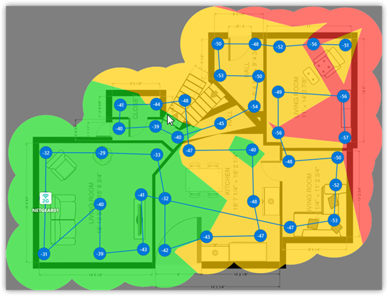
What you may see: Areas that fall below the selected threshold may experience weaker connectivity, reduced performance, or unstable connections.
If large parts of the map appear in the warning or critical range, the AP placement may not be sufficient for the selected coverage goal.
Coverage often becomes weaker in distant rooms, corners, or areas separated by walls and other obstacles.
What you can do: First, focus on the red zones.
Check whether walls, room layout, or distance to the access point are causing weak coverage.
Move the access point to a more central or open location.
Add another access point if the weak zone is too far away.
How to check: After you move the router, add an AP, or change settings, do not rely on guessing. In a real Survey project, run the survey again in the same area and save it as a new snapshot if possible. Then compare the same map before and after. In a Planning project, create a new snapshot with the changed AP placement and compare it with the previous one.
Slow Wi-Fi. Is Another Network Fighting with Yours?
If the Wi-Fi bar looks strong but the internet still feels slow, check Signal-to-Interference Ratio and Overlapping Channels.
This is where many beginners get confused. A strong signal only means your device can hear the router well. It does not guarantee that the air around it is clean. If other nearby networks are using the same or overlapping channels, your Wi-Fi may still slow down.
Signal-to-interference ratio, or SIR, compares your WiFi signal to interference from other radio transmitters, especially other WiFi networks using the same or overlapping channels.
This is different from noise. Noise usually means non-WiFi interference, such as microwave ovens, cordless phones, Bluetooth devices, wireless cameras, or other electronics. SIR focuses on WiFi-related interference from other WiFi transmitters.
A high SIR is good. A low SIR means your signal may be strong enough, but it still has to compete with other networks.
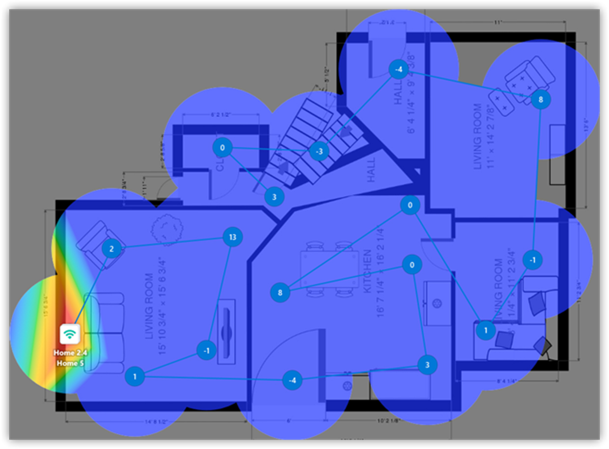
On this visualization, the key value in the specification table is Max SIR. It shows the highest signal-to-interference ratio reached by the selected network, access point, or band. Think of it as the best-case interference condition on this map. The heatmap itself shows where this clean signal stays strong and where interference becomes a problem across the floor plan.
Overlapping channels (SIR) is troubleshooting heatmap. It helps identify areas where channel overlap may negatively affect WiFi performance. Because it is intended for troubleshooting rather than detailed visualization, it uses threshold-based categories instead of a continuous color gradient.
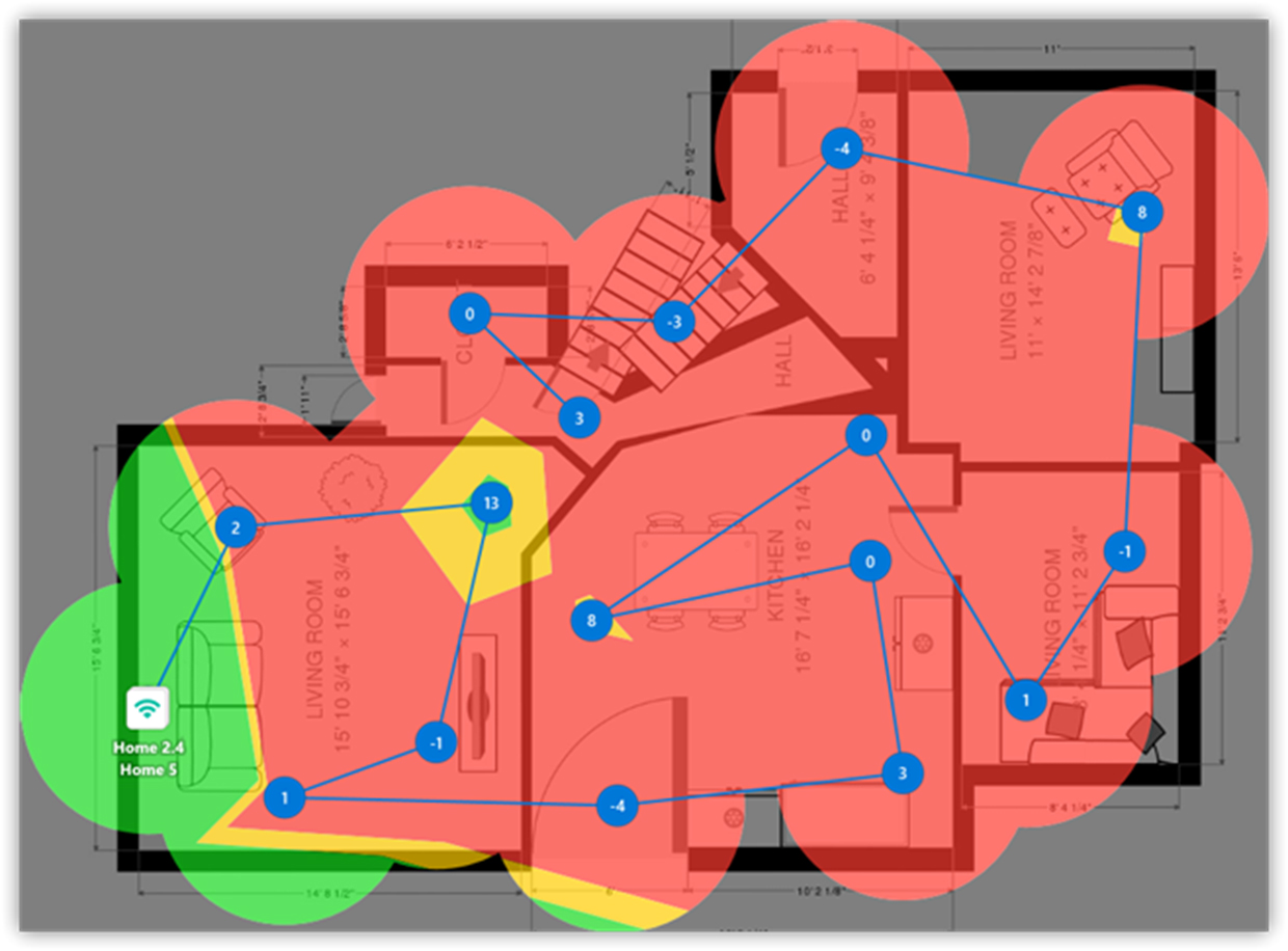
The heatmap is based on signal-to-interference ratio (SIR) and highlights areas that meet, approach, or fall below the selected SIR targets.
What you may see: Look for areas where Signal Level looks acceptable but SIR or Overlapping Channels looks poor. That usually means the issue is not simple coverage. It may be interference, channel congestion, or poor channel planning.
If poor SIR appears mostly on 2.4 GHz, the channel may be crowded.
If the map improves on 5 GHz or 6 GHz, moving compatible devices to those bands may help.
If only one area has poor SIR, check what is nearby: neighboring APs, guest networks, extenders, IoT devices, or other wireless equipment.
Differences between the 2.4 GHz and 5 GHz versions of Overlapping Channels heatmap may indicate that one band has a cleaner radio environment than the other.
At this point, it also helps to go back to NetSpot itself and check the Inspector mode. The channel table can show which networks are nearby, which channels they use, and whether your network is sitting on a crowded or overlapping channel. This makes the heatmap easier to understand because you can connect what you see on the map with what is happening in the Wi-Fi environment.
What to try:
Check the Channel column in the table under the Overlapping Channels heatmap.
On 2.4 GHz, avoid partially overlapping channels and use 1, 6, or 11 when possible.
Make sure nearby APs are not competing on the same channel unless that design is intentional.
Reduce channel width in crowded environments if wide channels increase interference.
Compare the 2.4 GHz and 5 GHz versions of this heatmap to see which band has the cleaner radio environment.
Use 5 GHz or 6 GHz for devices that support it.
Reduce unnecessary SSIDs if your own network broadcasts too many of them.
Adjust AP placement or transmit power if your APs interfere with each other.
How to Change Your Wi-Fi Channel: Step-by-Step Guide
How to check: Compare the same SIR or Overlapping Channels heatmap after the change, and then check the channel table in Inspector again to confirm that the channel situation actually improved.
Wi-Fi keeps disconnecting
If Wi-Fi keeps disconnecting completely, start with Signal Level, Low Signal Level, and Secondary Signal Level.
This is a different problem from slow Wi-Fi. Slow Wi-Fi may still have a stable connection, but disconnects usually mean the device is losing a usable signal, struggling to stay connected, or failing to roam smoothly between access points.
Look for areas where Signal Level drops too low, where Low Signal Level highlights problem spots, or where there is no usable Secondary Signal Level available. If disconnects happen only in specific rooms, corners, hallways, or near certain walls, the cause may be weak coverage, heavy obstacles, or a roaming gap between APs.
It can also help to go back to NetSpot itself and use Inspector mode while moving through the problem area. Watch the signal strength in real time. If the signal suddenly drops, jumps up and down, or your device keeps switching between APs, that may explain why the connection keeps disconnecting.
What to try: Move the router or AP closer to the problem area, remove physical obstacles where possible, add another AP or mesh node, adjust AP placement, or lower transmit power if devices are sticking to the wrong AP for too long.
How to check: Compare the same Signal Level, Low Signal Level, or Secondary Signal Level heatmap after the change, and then use Inspector mode again to see whether the signal stays more stable while you walk through the area.
For a deeper explanation of common causes, see: Why Does WiFi Keep Disconnecting?
Wi-Fi drops when you walk around. Do You Have Backup Coverage?
If Wi-Fi drops when you walk around, check Secondary Signal Level and Low Secondary Signal Level.
These maps are useful when the network has more than one access point. The main Signal Level map shows the strongest available signal. Secondary Signal Level shows whether another usable AP is available nearby.
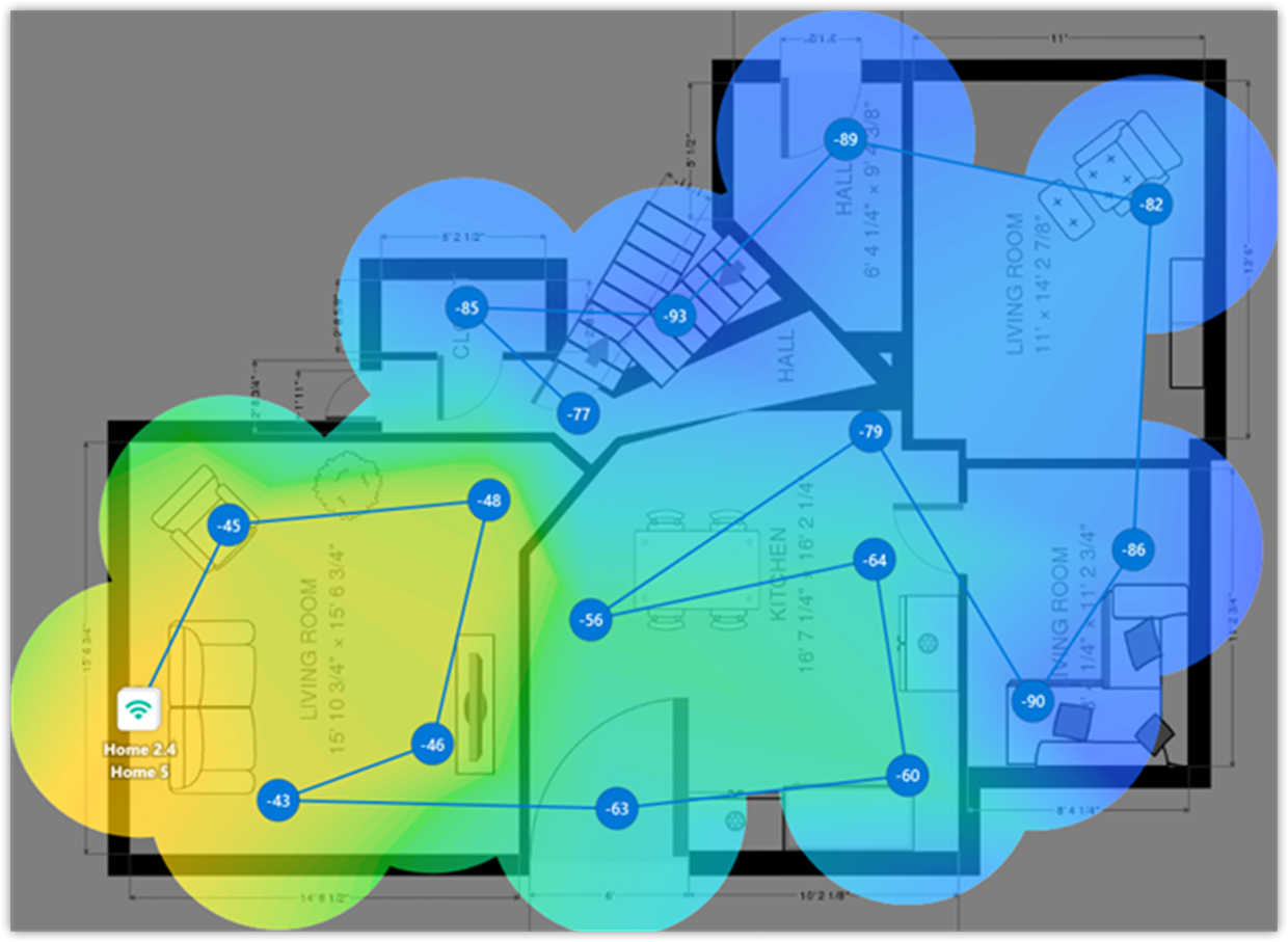
This matters for roaming. When someone moves through a house, office, hallway, or meeting area, their device may need to switch from one AP to another. If there is no usable secondary signal in transition areas, roaming may feel slow, sticky, or unstable.
On the heatmap, look at how evenly the secondary signal covers the floor plan. Warmer colors usually mean that another AP is available with a stronger backup signal. Cooler colors mean the second-best signal is weaker. If large parts of the map stay cool or empty, that area may technically have WiFi coverage, but it may not have good backup coverage from another AP.
Low secondary signal level is a troubleshooting version of the Secondary signal level heatmap. Rather than showing a full range of secondary signal values with a gradient, it classifies areas according to predefined thresholds so that roaming and backup coverage issues are easier to spot.
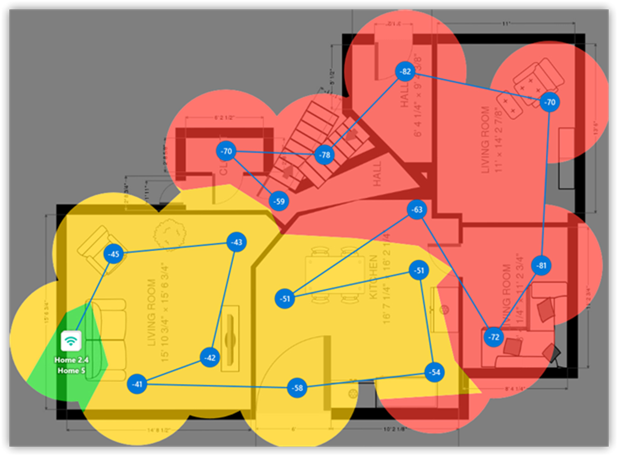
Like other troubleshooting heatmaps, it uses a simple status-oriented color scheme because the goal is to quickly identify areas that meet requirements, areas that are borderline, and areas that need attention. Areas below the selected threshold may not have sufficient backup coverage for smooth roaming between APs.
What you may see: If the secondary signal is weak or missing in large parts of the map, the network may depend too heavily on one AP.
If the primary Signal level map looks good but Secondary signal level looks poor, the network may work in normal conditions but feel unstable when clients move or when one AP becomes unavailable.
If the secondary signal is weak in hallways, open office areas, or meeting room entrances, roaming may suffer exactly where people are most likely to move between AP coverage areas.
If the secondary signal is too strong almost everywhere, APs may overlap too much. In that case, some clients may stay connected to the wrong AP for too long instead of moving to a better one.
What to try:
Add or reposition access points to create smoother overlap between coverage areas.
Avoid placing all APs too close together.
Reduce AP power if everything overlaps too much.
Make sure APs cover transition areas such as hallways, meeting rooms, entrances, and open office zones.
Compare the Secondary signal level map with the regular Signal level map before changing AP placement.
Check roaming behavior with real client devices, not just the map.
How to check: compare Secondary Signal Level before and after the change, and test with real devices while moving through the space.
Do you need additional AP?
If you are not sure whether you need another AP, check Signal Level, Quantity of Access Points, and SIR together.
Do not add APs blindly. More access points do not automatically mean better Wi-Fi. Sometimes an area has poor coverage and really needs another AP. But sometimes there are already too many APs audible in the same space, and the real problem is interference, channel overlap, or transmit power.
Look at Signal Level first to see whether the weak area is truly under-covered.
Then look at Quantity of Access Points to see how many access points are detectable at each measurement point or predicted location.
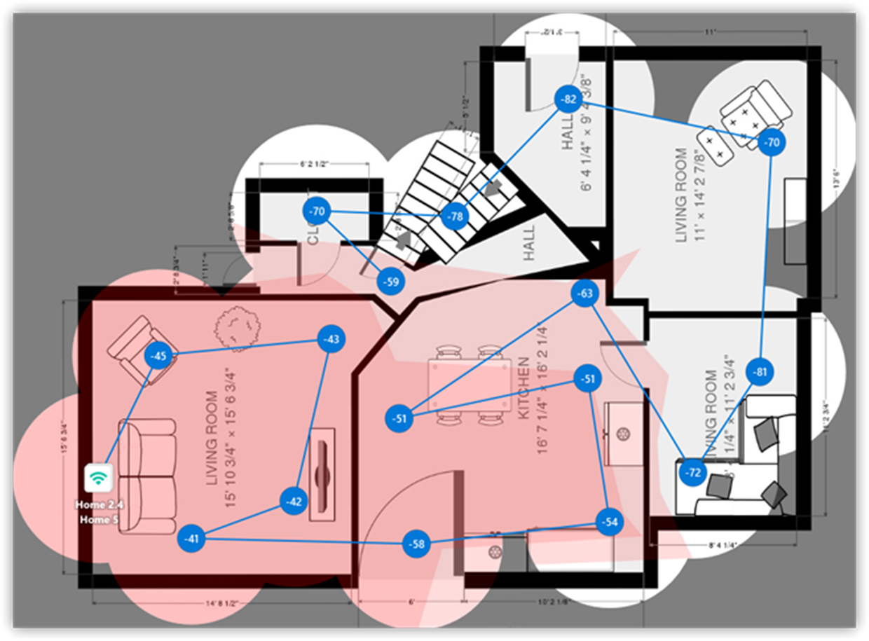
This visualization is not about speed by itself. It is about visibility and overlap. In a well-designed network, important areas should usually hear enough APs for stable coverage and roaming, but not so many strong APs that the radio environment becomes messy.
What you may see: If an area detects zero or only one AP, it may be vulnerable to weak coverage or roaming problems.
If an area detects too many APs, especially on the same band or channel, there may be unnecessary overlap or interference.
If AP quantity is high but signal quality is still poor, the problem may be channel planning, transmit power, or interference rather than the number of APs.
Then check SIR or Overlapping Channels to see whether those APs are helping or competing with each other.
What to try:
Do not add APs blindly just because one room feels slow.
Add an AP only if coverage is truly missing.
Check whether existing APs are on proper channels. Change channels if APs are interfering.
In dense environments, reduce AP power or redesign placement instead of simply adding more hardware.
How to check: Compare the same maps across snapshots instead of judging only one visualization.
Should I use 2.4 GHz, 5 GHz, or 6 GHz?
If 2.4 GHz works but 5 GHz or 6 GHz does not, check Frequency Band Coverage and band-specific Signal Level maps.
Frequency band coverage determines whether a 2.4 GHz, 5 GHz, or 6 GHz network is available in a particular area.
This is critical, as each band operates differently. The 2.4 GHz frequency extends further and penetrates walls better, but is more congested and slower. The 5 GHz frequency guarantees higher speeds and clearer air, but its range is shorter. The 6 GHz band provides the clearest signal and superior speeds for compatible WiFi 6E or WiFi 7 devices, but its coverage area is typically the shortest.
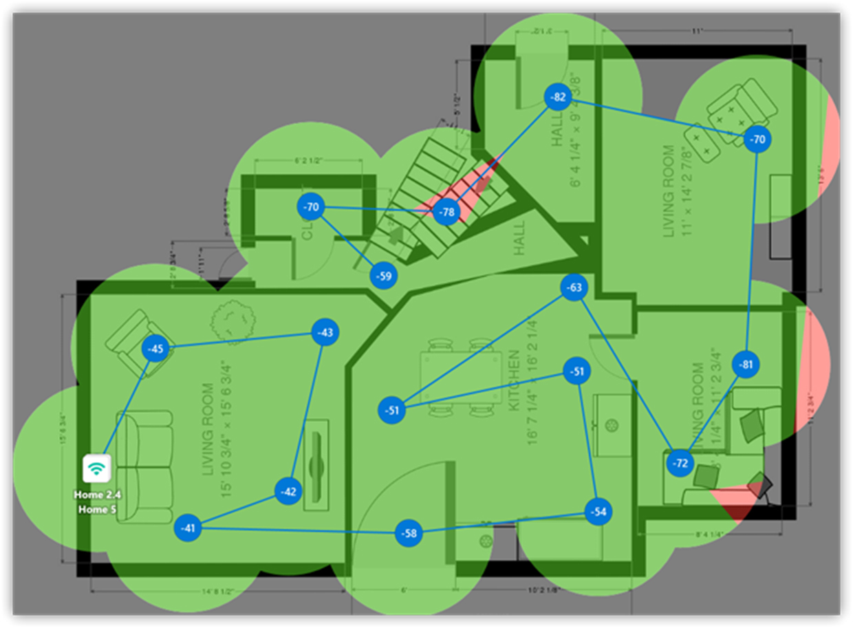
What you may see: If the map is mostly 2.4 GHz, your network may cover the space but not provide the best performance.
If 5 GHz or 6 GHz disappears in distant rooms, walls or distance may be limiting higher-band coverage.
If important work areas have only 2.4 GHz coverage, users may experience slower speeds even if the connection technically works.
What to try:
Add or reposition APs to improve 5 GHz or 6 GHz coverage in high-use areas.
Keep 2.4 GHz for IoT, legacy devices, and long-range coverage.
Use 5 GHz or 6 GHz for laptops, phones, video calls, and high-throughput tasks when possible.
Do not judge the network only by “does it connect?” Check which band clients actually use.
How to check: Compare Frequency Band Coverage and band-specific Signal Level maps after the change.
What WiFi Standard Is Available?
If devices connect using older Wi-Fi standards, check PHY Mode Coverage.
PHY mode coverage shows which WiFi technology or standard is available in different parts of the map. You may see modes such as 802.11n, 802.11ac, 802.11ax, or 802.11be, depending on the network and equipment.
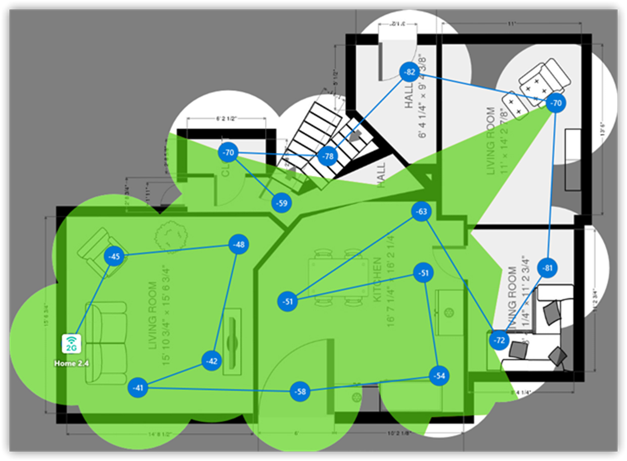
This helps you understand whether users are getting modern WiFi capabilities across the space or falling back to older modes in some areas.
What you may see: If most of the map uses modern modes like ax or be, the network design is likely using newer WiFi standards well.
If some areas fall back to older modes, performance may be lower there.
If older client devices are present, they may limit their own performance even when the AP supports newer standards.
What you can do: Check whether your access points and client devices support the same WiFi standard.
Upgrade old routers or adapters if they limit performance.
Improve signal strength in areas where clients fall back to slower modes.
Use this map together with Signal level and Frequency band coverage.
Slow Internet Speed
If the internet is slow even though you’re connected to Wi‑Fi, start with Download Speed, Upload Speed, Low Download Rate, and Low Upload Rate.
A strong Wi-Fi signal does not always mean fast internet. Your device may be connected to the router just fine, but the actual speed can still be poor because of interference, congestion, router limits, ISP issues, or weak performance in a specific part of the space.
If the report includes results from active scanning, pay special attention to the speed-related heatmaps. Active scanning measures real network performance during the survey, so heatmaps like Download Speed, Upload Speed, Low Download Rate, and Low Upload Rate can show where the connection actually becomes slow, not just where the signal becomes weaker.
Look for areas where Signal Level looks acceptable but Download Speed or Upload Speed is low. That usually means the problem is not only coverage. It may be related to channel congestion, interference, overloaded equipment, or the internet connection itself.
It can also help to go back to Inspector mode to check the surrounding Wi-Fi networks and channels. If many nearby networks use the same or overlapping channels, the speed may drop even when the signal looks strong.
What to try: Compare 2.4 GHz and 5 GHz performance, move closer to the AP, switch to a cleaner channel, avoid partially overlapping 2.4 GHz channels, reduce unnecessary SSIDs, restart or replace overloaded equipment, or check whether the ISP speed is lower than expected.
How to check: Run the same active survey again after the change and compare the Download Speed, Upload Speed, Low Download Rate, or Low Upload Rate heatmaps. If the slow areas become smaller or disappear, the change helped.
For a deeper explanation of common causes, see: Why Is My Internet So Slow?
How to Recognize Common Patterns on a Heatmap
A heatmap is not just about “good color” and “bad color.” The shape of the colored area can tell you a lot.
A smooth fade away from the router or AP usually points to normal signal loss over distance. The farther the device is from the access point, the weaker the signal becomes. In this case, moving the AP more centrally, raising it higher, or adding another AP may help.
A sharp drop after a wall or object often means something physical is blocking the signal. Thick concrete, brick, metal, mirrors, tile, elevators, large appliances, server racks, cabinets, or even a TV mounted on a wall can weaken Wi-Fi. In this case, moving the AP to the other side of the obstacle may work better than simply increasing transmit power.
A dead zone in one isolated room or corner usually means the signal cannot reach that area well. Check what sits between the AP and that room. Bathrooms, kitchens, closets, utility rooms, and stairwells can all create difficult paths for Wi-Fi.
A good Signal Level map but poor SIR or Overlapping Channels map usually means the issue is not coverage. The AP may be loud enough, but the radio environment is crowded. In this case, channel planning, band selection, channel width, or AP power may matter more than moving the router closer.
A 2.4 GHz map that looks much better than 5 GHz or 6 GHz is common. 2.4 GHz usually travels farther and passes through walls better, but it is often slower and more crowded. 5 GHz and 6 GHz can be faster and cleaner, but they usually need better AP placement because they do not travel as far.
A map with too many APs visible everywhere does not automatically mean the design is good. It may mean there is enough coverage, but it may also mean there is too much overlap. If many APs are heard in the same area and performance is still poor, check channels, transmit power, and SIR.
A troubleshooting map with red or yellow zones means those areas do not meet the selected requirement or are close to the limit. Do not panic over one small red spot in a storage room nobody uses. Focus first on places where people actually need Wi-Fi: desks, meeting rooms, bedrooms, living rooms, checkout areas, classrooms, or work zones.
How to Compare Snapshots Without Getting Lost
When a report includes more than one snapshot, compare only the same visualization across snapshots. For example, compare Signal level in Snapshot #1 with Signal level in Snapshot #2. Then compare SIR with SIR, Frequency band coverage with Frequency band coverage, and Low signal level with Low signal level. Do not compare Signal level in one snapshot with Overlapping channels in another snapshot and try to draw a final conclusion from that.
In the example report, Snapshot #1 contains one AP, while Snapshot #2 contains two APs. That means the report can be read as a before-and-after design comparison. If the weak areas shrink, band coverage improves, or secondary signal becomes more usable in Snapshot #2, the added AP likely helped. If SIR or overlapping channel maps become worse, the new AP placement or channel plan may need adjustment.
A good workflow is simple: choose one question, choose the matching visualization, compare the same visualization across snapshots, and then decide what changed. This prevents the report from turning into a pile of unrelated heatmaps.
Conclusion
A NetSpot report is not just a set of pretty heatmaps. It is a map of why your WiFi behaves the way it does — or, in a predictive report, how your WiFi design is expected to behave.
If the report feels overwhelming, do not panic. You do not have to understand the whole document in one sitting. Start with the project structure, pick the problem you actually have, find the heatmap that matches it, read the legend, and look at the map one area at a time.
The report may look technical, but the logic behind it is simple: weak signal points to coverage problems, poor SIR points to interference, missing band coverage shows where 5 GHz or 6 GHz does not reach, and secondary signal helps you understand roaming. Once you spend a little time with the maps, the picture usually becomes much clearer.
Remember that no single heatmap tells the whole story. The real value comes from comparing them and looking for patterns that explain what users experience in the space. A room with weak coverage, high interference, and poor roaming conditions will often reveal itself across several maps at once.
You do not need to become a Wi-Fi expert to benefit from the report. By working through the heatmaps step by step, you can recognize the root causes of performance issues, make informed improvements, and verify whether those changes actually solve the problem.