This visualization will show you the number of access points detectable at each measurement point on the map. If you hover over the measurement markers on the map and look at the AP names on the left, you can see the exact signal levels for each location.
The Quantity of Access Points visualization is one of the PRO visualizations available only to those that have upgraded to the PRO or Enterprise version of NetSpot.
There are several ways you can adjust this heatmap view:
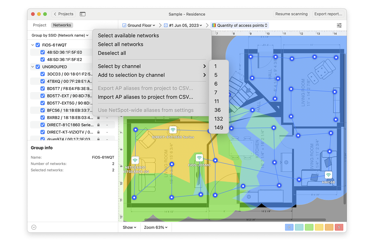
- Wi-Fi Network: Each Wi-Fi network detected can be mapped individually. Simply check the box next to the network(s) you wish to view on the left-hand side of the NetSpot window.
- Wi-Fi Channel: By clicking on the icon
 at the top of the left panel in NetSpot (above the networks list), you can also view the quantity of access points by channel.
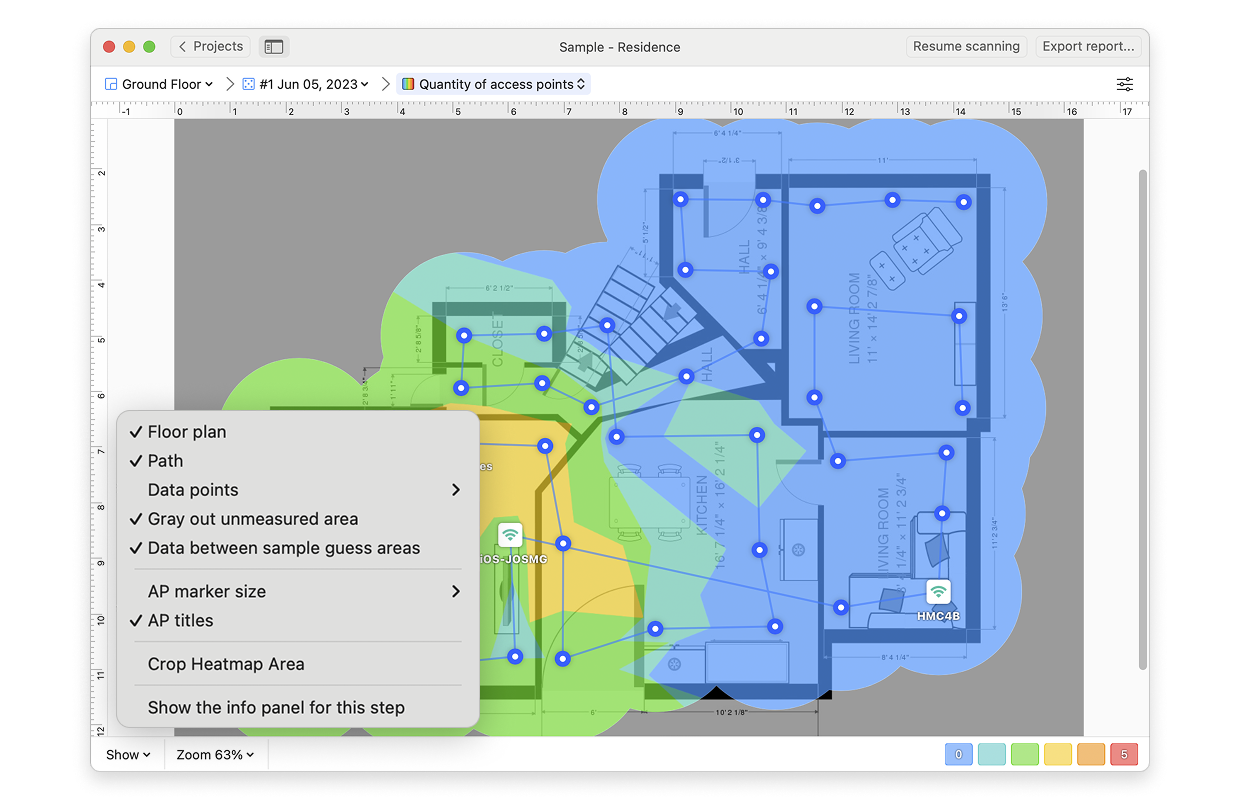
- View: By clicking on the Show menu in the bottom left corner of the canvas, you can choose whether to show your floor plan, path, sampling points, and AP titles on the heatmap, as well as several other adjustments.
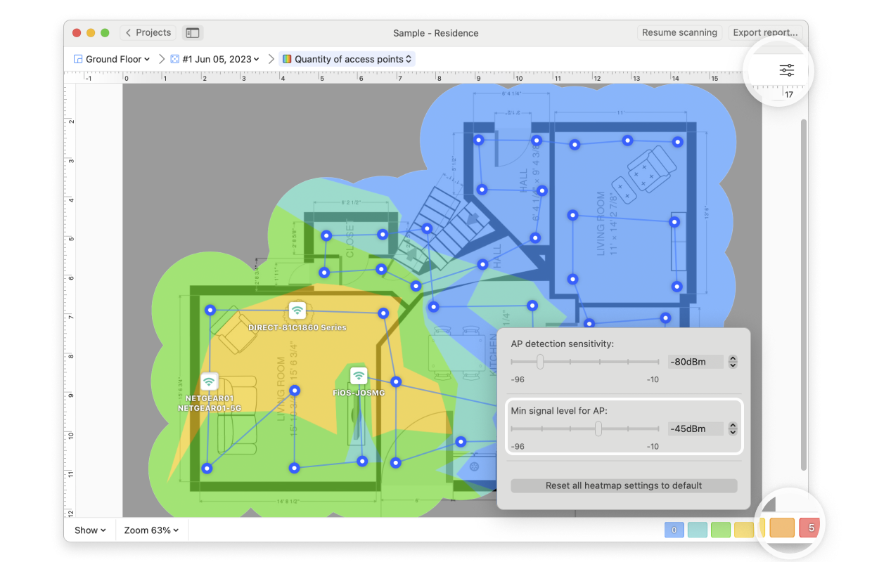
- AP Detection Proximity: By clicking the Heatmap Settings icon at the top right or by clicking on the gradient on the lower right, you can filter out weaker access points (APs) by adjusting the AP detection proximity slider. The default value is -50dBm.
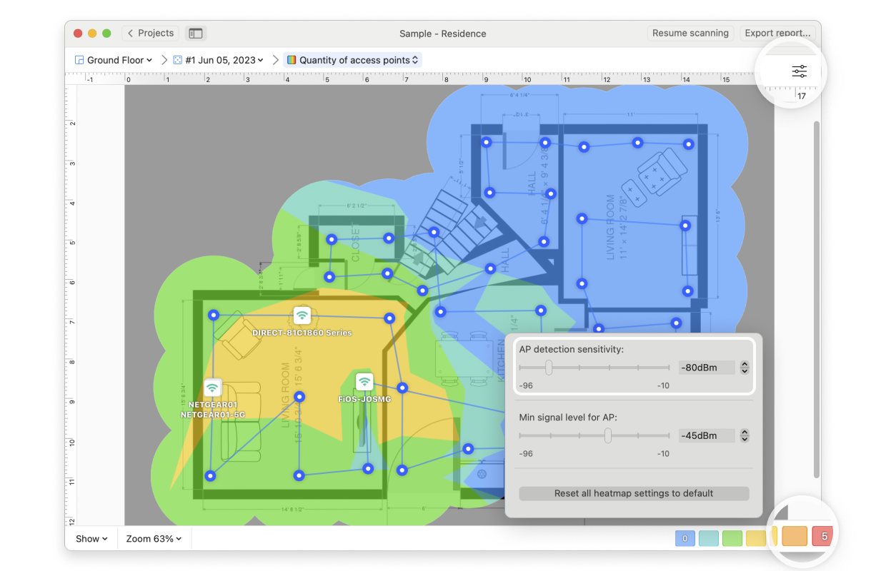
- Min Signal Level for AP: By clicking the Heatmap Settings icon in the upper right corner of the app window or by clicking on the gradient on the lower right, the Minimum Signal Level can be adjusted. This setting specifies the minimum signal level a certain AP has to produce to be included in this visualization. The default is -70dBm.
NetSpot Wi-Fi analyzer for Windows is released
updated: July 15, 2025 author: