The Frequency Band Coverage visualization shows you which frequency bands are present in your scanning area and where the actual signal is present:
- Pink represents the 2.4GHz band
- Green represents the 5GHz band
- Deep Blue represents the 6GHz band
- White represents areas where no frequency is detected above the frequency coverage signal level specified in the settings (see below).
The Frequency Band Coverage visualization is available only to those who have upgraded to the PRO or Enterprise versions of NetSpot on both—macOS and Windows operating systems.

There are several ways you can adjust this heatmap view:
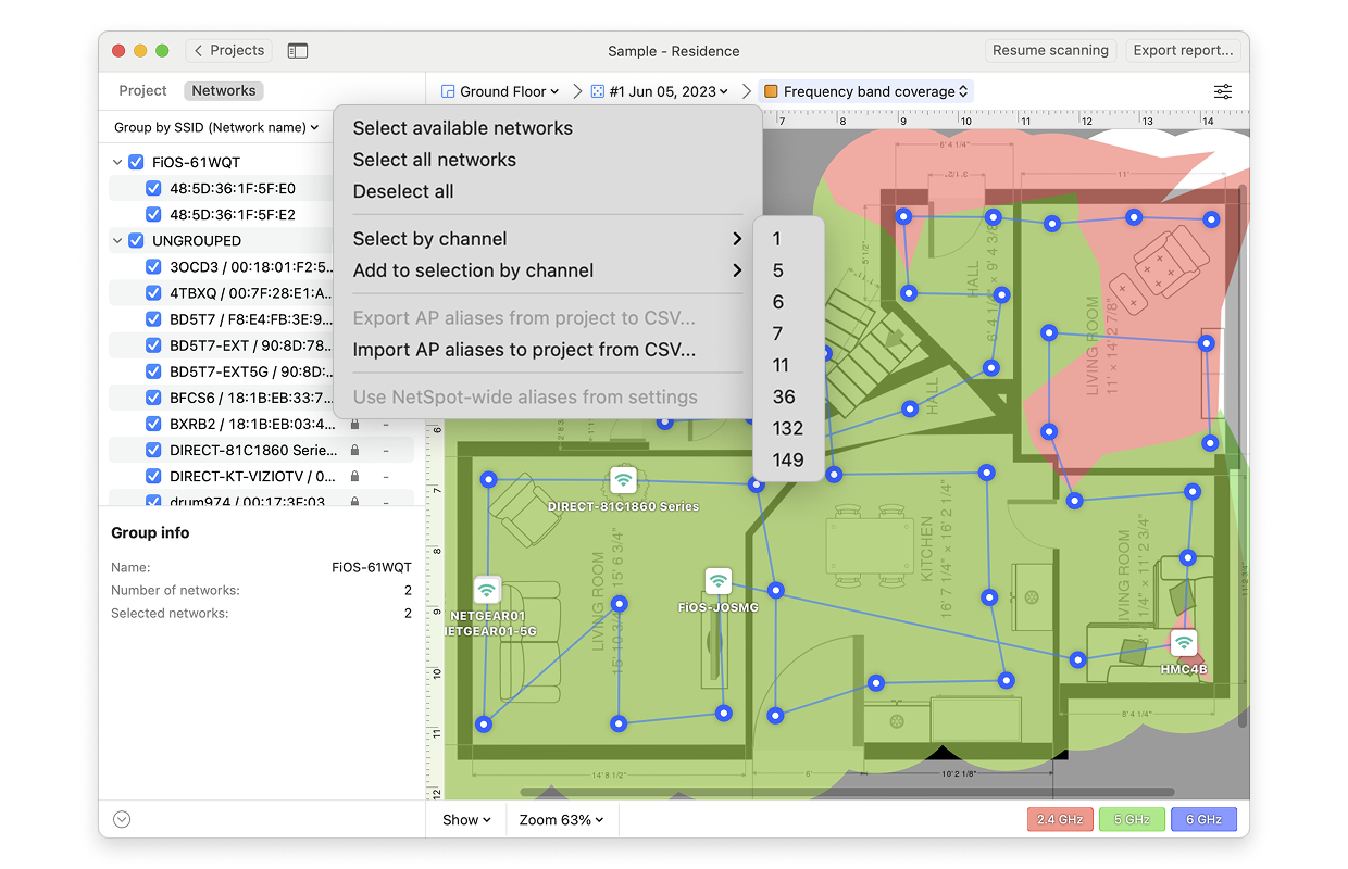
- Wi-Fi Network: Each Wi-Fi network detected can be mapped individually. Simply check the box next to the network(s) you wish to view on the left-hand side of the NetSpot window.
- Wi-Fi Channel: Click (
 ) at the top of the left panel in NetSpot (above the networks list) to visualize networks broadcasting on certain channels.
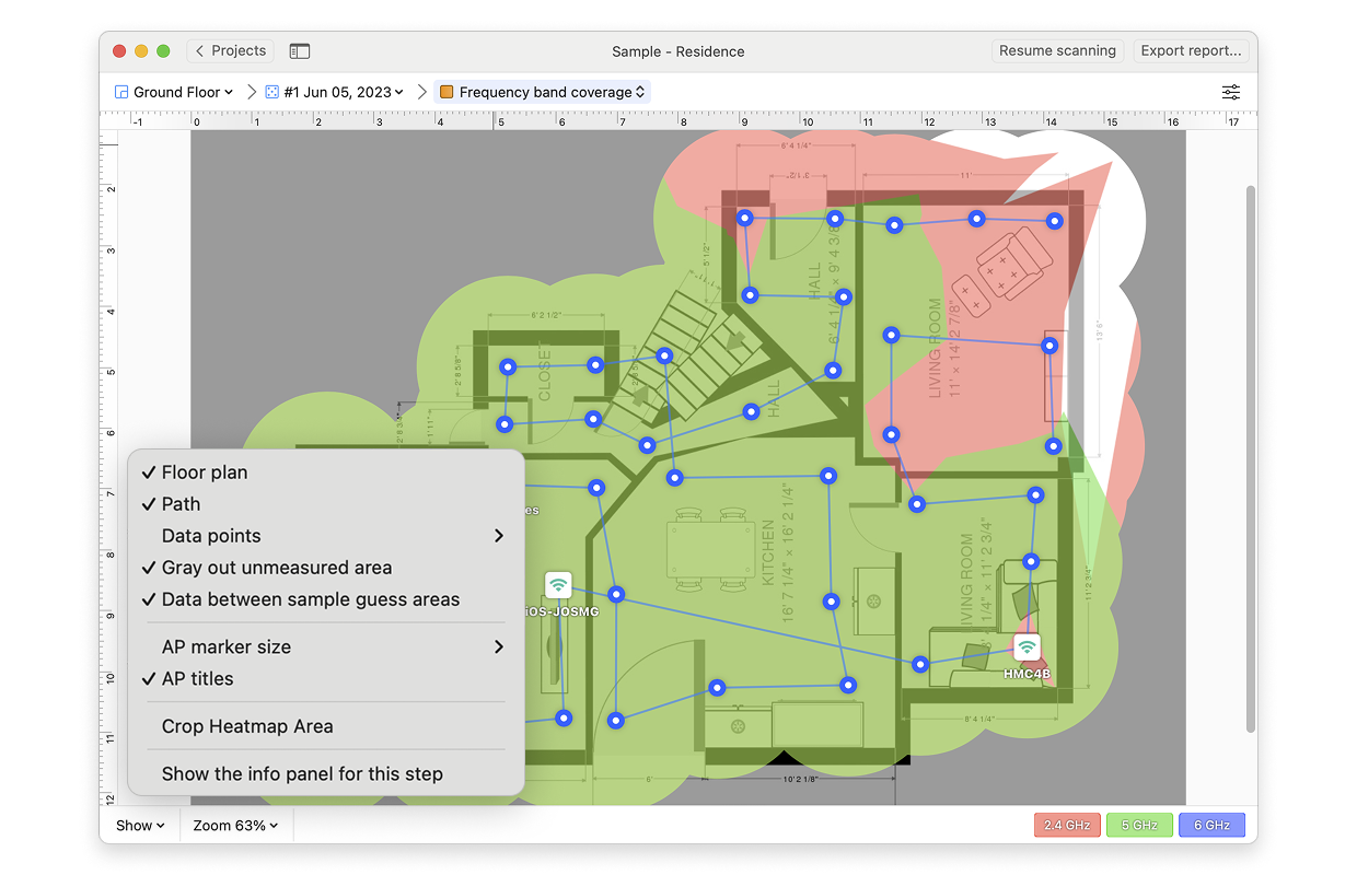
- View: By clicking on the Show menu in the bottom left corner of the canvas, you can choose whether to show your floor plan, path, sampling points, and AP titles on the heatmap, as well as several other adjustments.
- AP Detection Proximity: By clicking the Heatmap Settings icon at the top right or by clicking on the gradient on the lower right, you can filter out weaker access points (APs) by adjusting the AP detection proximity slider. The default value is -50dBm.
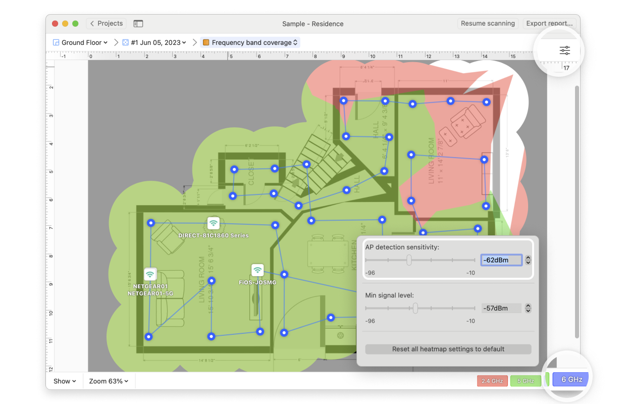
- Frequency Coverage Signal Level: By clicking the Heatmap Settings icon in the upper right corner of the app window or by clicking on the gradient on the lower right, the minimum signal level can be set. The default level is set at -70dBm.
NetSpot Wi-Fi analyzer for Windows is released
updated: July 15, 2025 author: